Next project
Employer dashboard
Role
UX/UI designer
Team
2 developers
Timeline
August - January 2025
Employer dashboard - everything recruiters need to know at a glance
😮💨 Problem
Recruiters faced challenges navigating the Ivy clinicians platform. When logging in, they weren't sure about next steps and lacked visibility into their status and performance, resulting in a demotivating user experience.
🚀 Goal
Enhance value by providing recruiters with actionable insights, including profile views, job post engagement, local search activity, and new job candidates. Additionally, streamline facility and recruiter management by enabling easy updates, and assignments.
💡 Solution
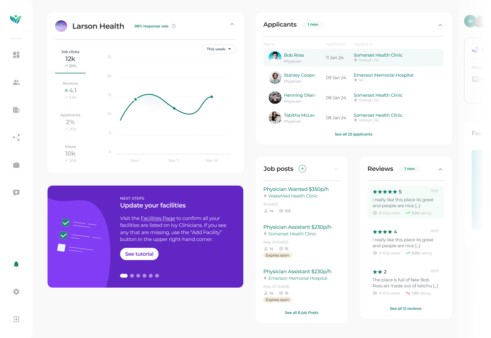
Once the recruiters logged in they will be met with the overview page on the employer dashboard, showing them all new relevant information at a single glance with shortcuts to their most important CTAs.
46%
More engagement from EM recruiters
63%
Less emails per week to our CTO from EM recruiters asking how the platform worked
75%
Rise in user satisfaction
FEATURE
Shortcuts & updates
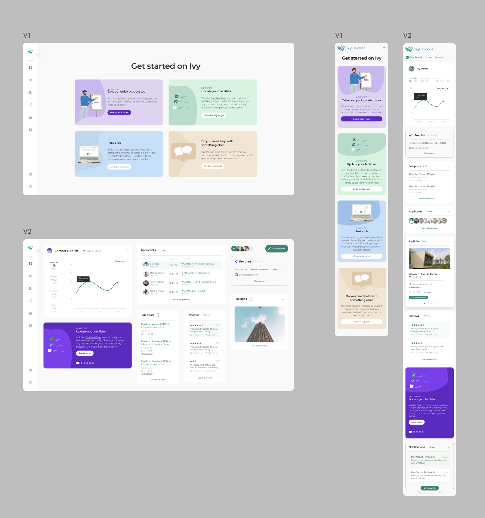
As soon as recruiters log onto the platform they are met with an overview of all activity such as various statistics, new candidates, job post views, and next steps guides. From this page they can also easily click into the relevant section to view more.
FEATURE
Next steps always there
From our user testing we saw that 100% of our particiants clicked through onboarding as fast as possible. We get it - they're busy. So just in case we included a section with tips and tricks to lend a helping hand if they should need it.
FEATURE
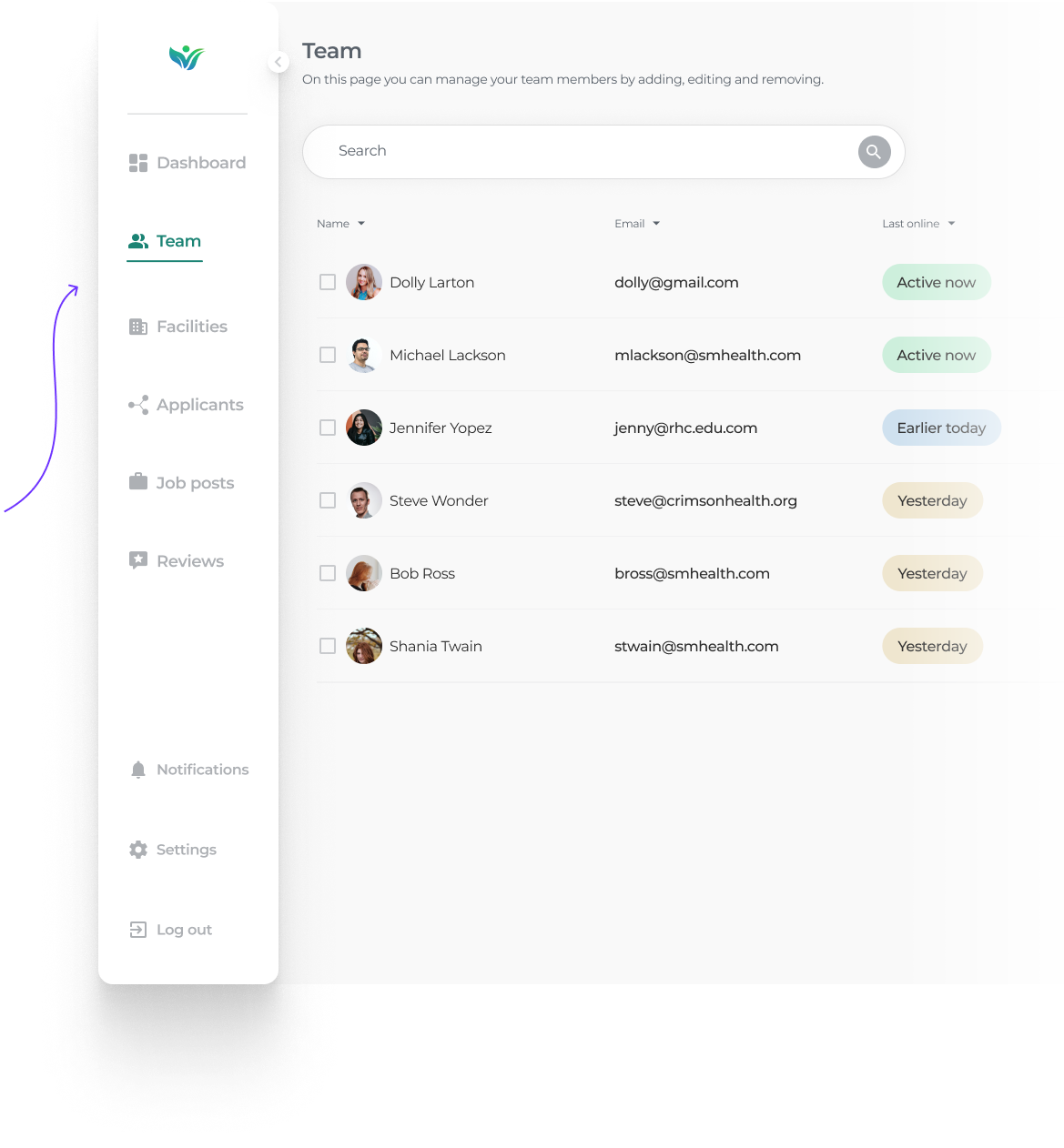
Dedicated full pages
The dashboard page gives recruiters a quick snapshot of everything, but the dedicated pages lets the recruiter dive deeper into applicants, job post analytics, team & facility management, reviews as well as settings and notifications.
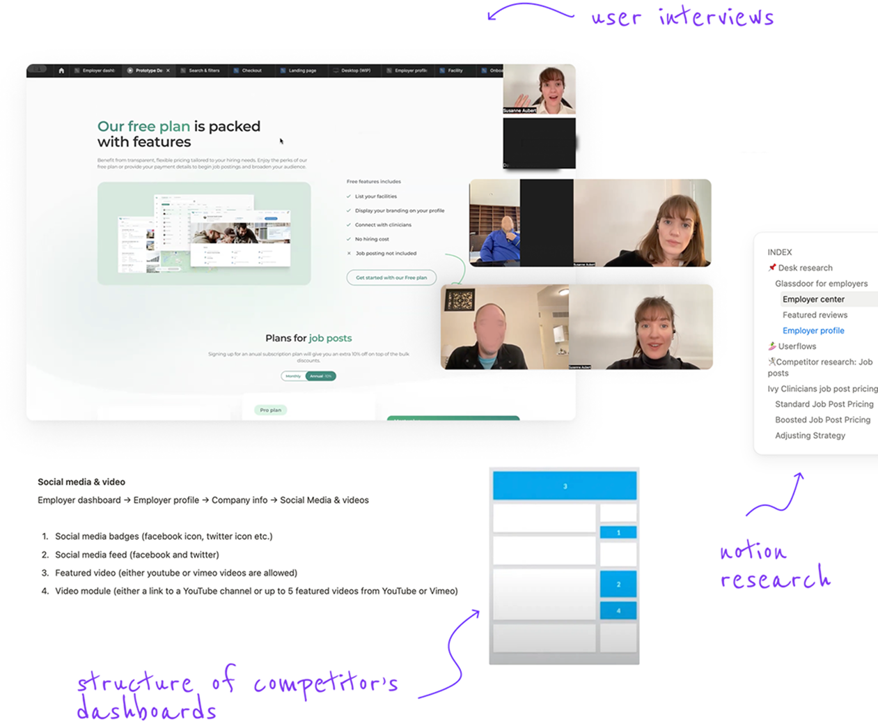
Competitive research
To ensure the dashboard effectively meets the needs of emergency medicine employers, I
conducted a competitive analysis of popular job and networking platforms such as Glassdoor,
PracticeMatch, PracticeLink, EM Careers, DocCafe, MedGeo, and GasWork. Analyzing and taking
note on their
structure and features.
I also interviewed recruiters from EM employer groups who were using these
job
boards
via zoom to get insights on pros and cons.
Once sufficient research was gathered I
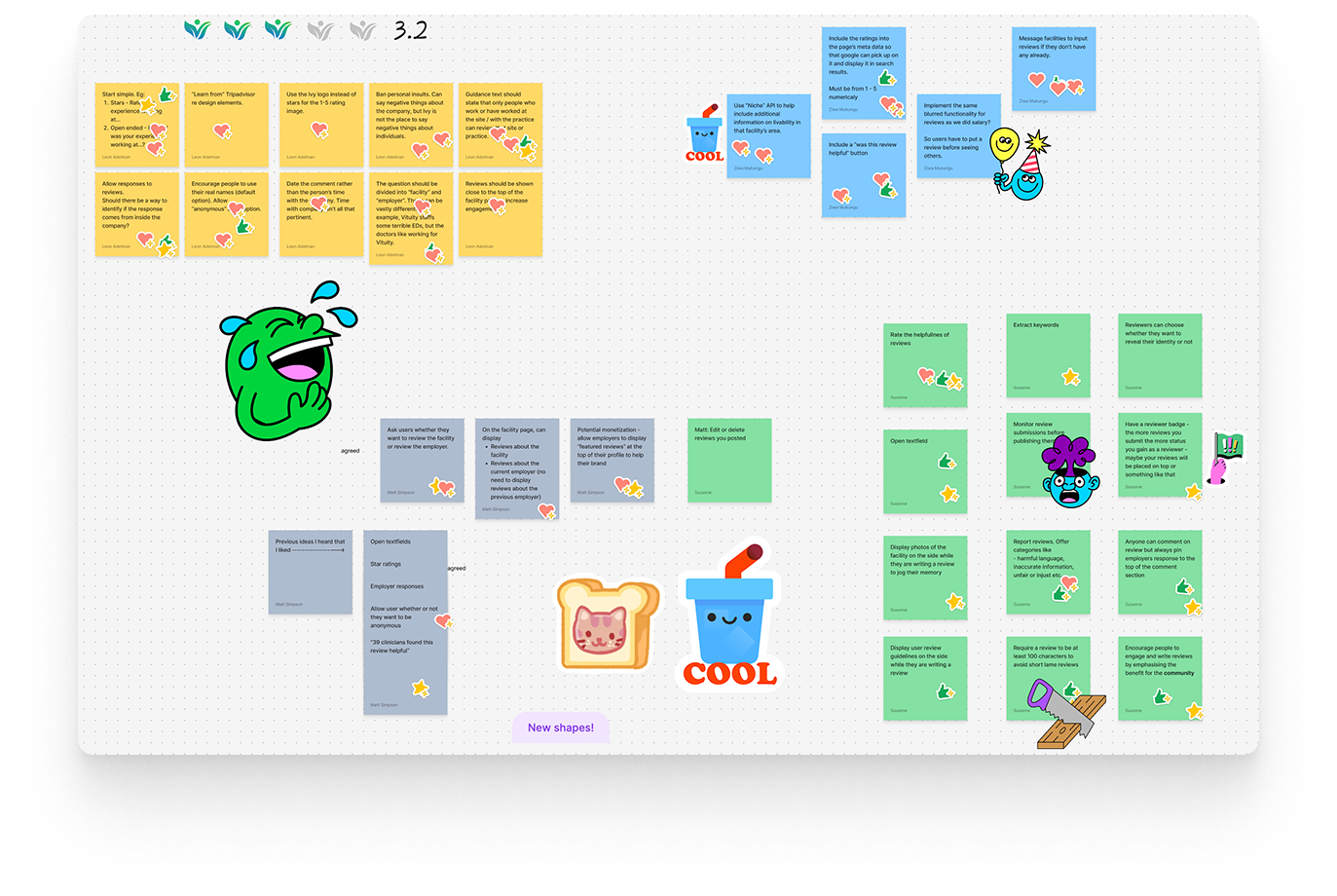
presented the findings to the team and organized a team
brainstorming figjam session to
discuss ideas.
💥🤺 Challenge
Presenting findings in an engaging way 🙇♀️
One thing I've learnt working in healthcare is that healthcare workers are busy and tired after work. I can't tell you how many times I've seen them mentally clock out after me talking design at them for more than 1 consecutive minute - and I totally get it. Keeping them engaged in a design conversation has always been a fun challenge. Discussing something as bland as pricing I brought out my big guns and incorporated storytelling with cartoon-esque user journeys (inspired by design.growth!)

Iterations
With this being such a large project it went through numerous iterations over several
months. As
the sole designer I was adament on making the designs as sound as possible and would
frequently test them with recruiters, clinicians, the CEO, our developers as well as friends
and family members.
I set up a prototype and went through it with recruiters
on
zoom
to hear what they had to say. I also uploaded the prototype to Useberry - a platform that
allows you to set certain tasks and then see how the users perform. This was a great async
option to get more feedback - doctors are very busy working 12hr shifts.
💥🤺 Challenge
Limited dev resources & implementation
Our 2 developers on the team really had their hands full with this one. To make the project
more feasible we decided to divide the project into smaller chunks with V1 & V2. We
started meeting every Monday to break down designs into story points and sprints in Jira.
We felt it was extremely important to not compromise on the onboarding
experience, so
in V1 the recruiters would be met with a next steps guide once they logged in.
Dev hand-over userflows
With such a large and complex project, ensuring a smooth developer hand-over was critical. Given the vast flows branching out from the dashboard, a significant amount of time was dedicated to crafting clear & detailed userflows. The userflows streamlined communication with the development team and reduced ambiguity resulting in a more efficient development process.
Impact & feedback
🕺🏻 Reduced confusion
Previously, our CTO spent significant time walking new recruiters through the platform using Notion documents. Now, with a clear, intuitive interface and built-in next steps, recruiter inquiries have dropped by over 63%, freeing up valuable time and making the process more efficient.
🔓 New clients unlocked
The enhanced functionality, sleek design, and intuitive experience of our new dashboard have already made a powerful impact. Within the first month, it helped us acquire seven new employer group clients —who not only love the product but believe it's changing the industry.
🚧 TBC...
Work on v2 was put on hold momentarily as the company was about to be acquired.